Why Beauty Brands Are Embracing Softer Design
Why Beauty Brands Are Embracing Softer Design
Luxury beauty used to stand out through bold colors and striking shapes. Today, the direction is changing. Across prestige skincare and color cosmetics, more brands are choosing warm neutral palettes, rounded silhouettes, and understated details that feel calm, refined, and timeless.
Quiet Colors. Stronger Brands.
Warm neutrals have become a defining element of premium beauty branding. Shades inspired by cream, beige, sand, and natural stone create products that feel sophisticated without overwhelming the senses. Rather than following short-lived trends, these colors help brands build a lasting visual identity.
Curves Inspired by Timeless Design.
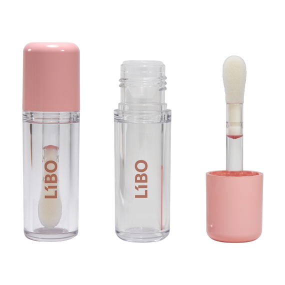
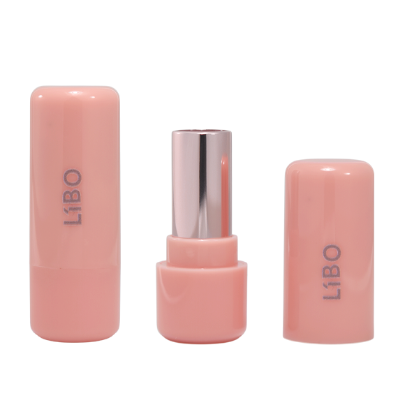
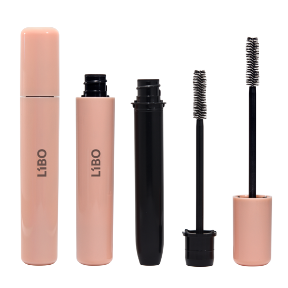
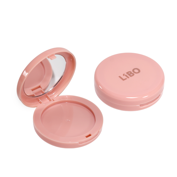
The Rome Series reflects this new design direction. Inspired by the elegant proportions of Roman architecture, the collection combines soft curves, balanced geometry, and clean lines to create a refined and contemporary appearance. Crafted from premium PETG, it offers both elegant aesthetics and lasting durability.
Designed for Everyday Beauty.
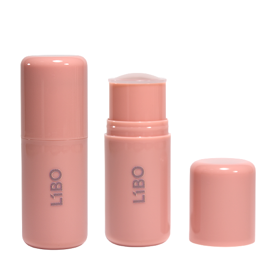
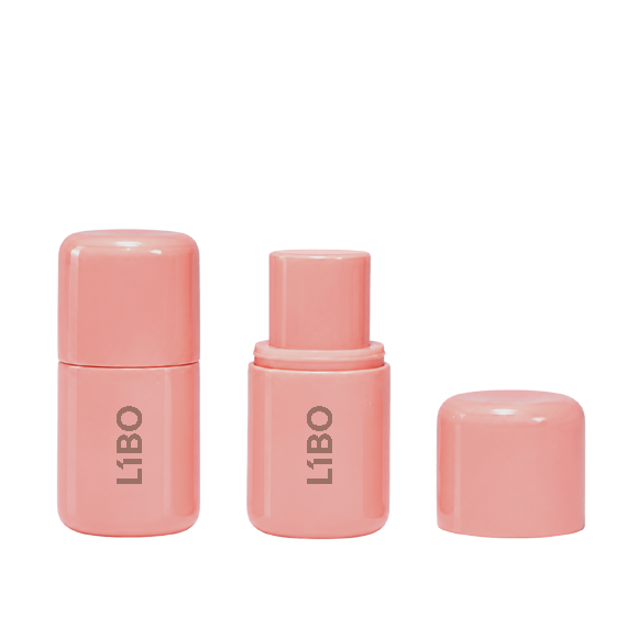
Beauty products are no longer made only for the vanity. They are designed to move with consumers throughout the day. Alongside a complete packaging collection, the Rome Series includes a compact stick format that is easy to carry and convenient for quick touch-ups wherever life takes you.
One Collection. One Identity.
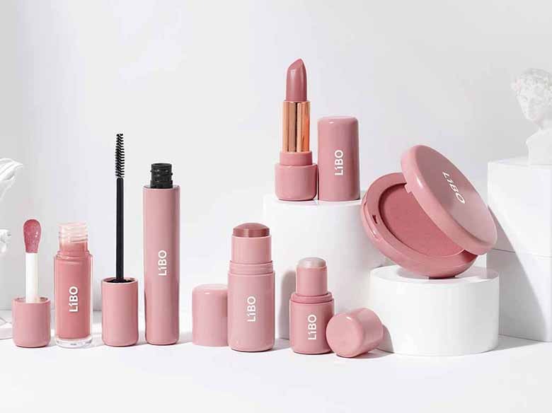
A recognizable brand is built through consistency. From lip products to compacts, the Rome Series offers a coordinated packaging collection that helps brands create a unified visual language across multiple product categories. Every package feels connected. Every product strengthens the brand.
The future of beauty packaging is not louder. It is more intentional. Soft forms, warm neutrals, and timeless design are more than aesthetic choices. They create products that feel approachable, memorable, and relevant for today's consumers. Discover the Rome Series and explore how thoughtful design can shape your next beauty collection.